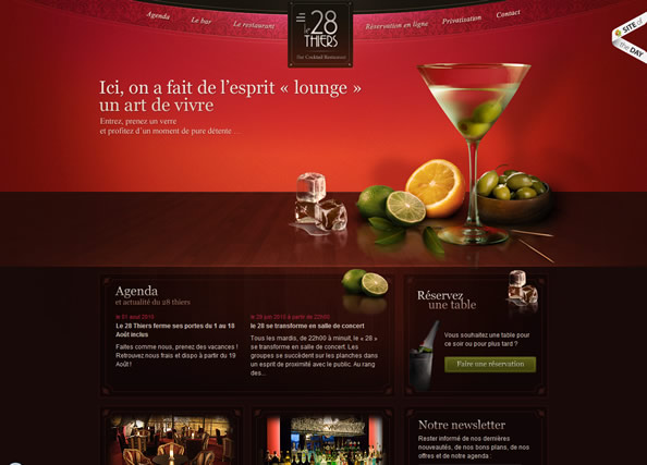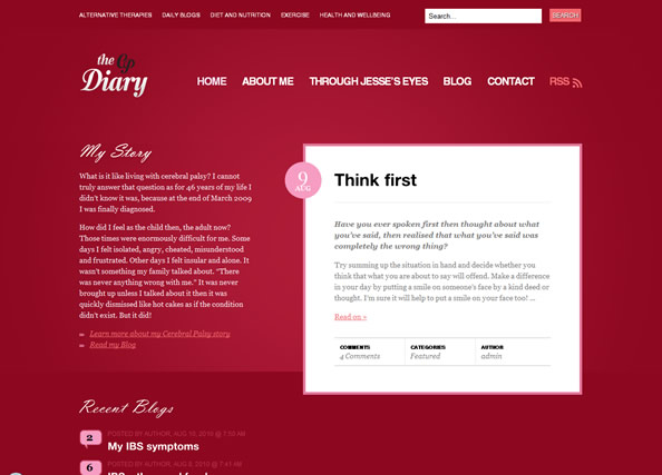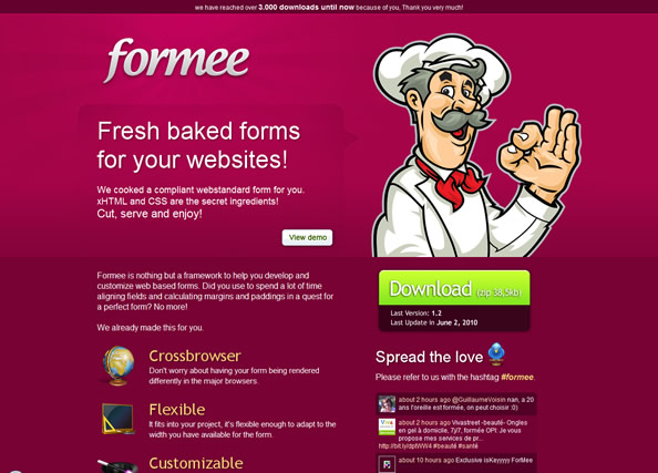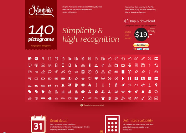
At Union Room, we’re always on the lookout for websites that use colours in interesting and consistent ways. The creative use of colour can take a website from a flat, lifeless set of graphics to an exciting and engaging piece of digital media.
We asked the guys over at brand communications agency Projector, what they thought of the role of colour in design. “Like a logo and font the colours used by a company within their branding form a significant part of any visual identity system. By having a consistent core colour palette it aids recognition and supports the brand values set – in a visual way at least. But, we must remember colours are influenced by fashion and regional perceptions, which is why many brands – certainly many global ones – use a secondary palette too – so by having a set of secondary colours that support the core palette it allows certain tonal tweaks without effecting the brand – this also adds to the core brands longevity, as by using up to the minute colours in a complimentary way it negates the ‘trend’ issue of the here and now for any brand.”
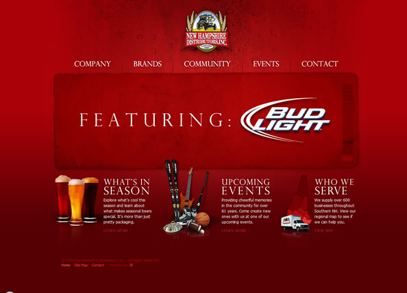
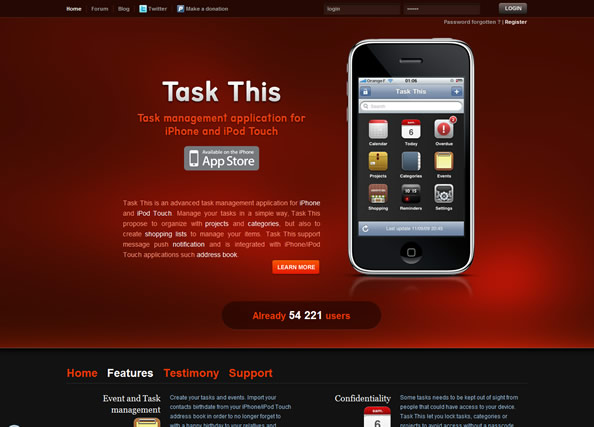
Lets take a look at 10 red (or variations of red) websites we really like the look of…
