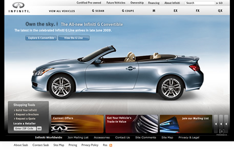
Much like our 20 amazing fashion websites blog post a while back, motor industry websites give the companies a real opportunity to show off the (sometimes) sleek and slick designs of their latest models.
They do come in for criticism from time to time as they are usually all flash websites but it’s my personal opinion that if a website is usable then it can be approached and built in any manner.
Here are our favourite motor industry websites…
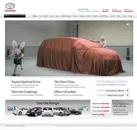
I’m a big fan of this website. It doesn’t just display a generic promotional video of it’s latest model like many other sites, it feels functional and most importantly it feels very interactive without losing the usability factor.
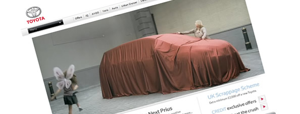
Although big video can be awfully done on some websites, the Toyota site has a very clean, high quality and quick loading video which displays it’s latest TV marketing campaign.
I also like the three-column layout that sits under the video although some kind of roll-over on titles may aid navigation slightly.
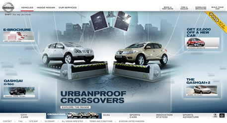
Quite a subtle flash background makes this site stand out and there isn’t any image overload like some other car websites. The internal pages are consistent and easy to navigate also.
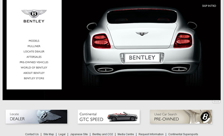
I love the bottom columns of this site and it uses some weird angles to make the layout break out of it’s grid.
The quality of the main flash movie is awful however, and should really be optimised a little bit better.
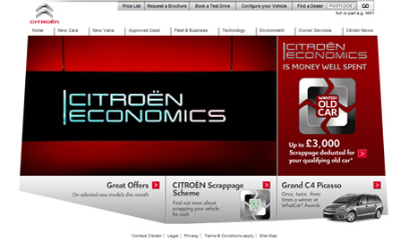
I’m not the biggest fan of the sites footer but it has gorgeous flash navigation when browsing through the various cars on the homepage coupled with some very high quality promo shots which results in a very sleek website.
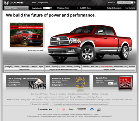
I like the look of the navigation on this site and the large interactive flash section in the middle looks great and works well.
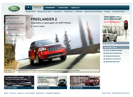
Although the homepage isn’t anything special, once you dive further into the site and begin browsing through the various sections it’s very well built and it implements flash video fantastically well.
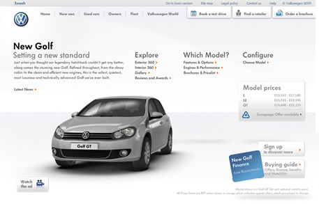
Apart from the loading transitions this doesn’t particlrarly look like a flash website, but the rollover movies when running your mouse over the various vehicles at the bottom of the page are very impressive.
Some of the colours used deeper into the site really jump off the page and help the images come alive.
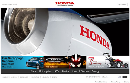
The navigation rollovers can be a little obtrusive on a large resolution but the sites colour scheme and use of white space helps the car imagery really stand out. The interactive view when looking at a car also allows you to change car colour and alloys dynamically which is a great feature.
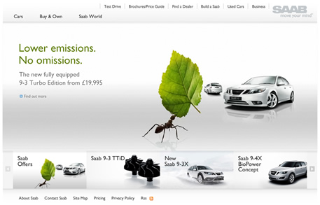
Not the most original layout but some nice big imagery as well as some nice and useable navigation rollovers.
