Currently it seems like everybody and their Gran is having a bit of a rebrand or a logo redesign, but is it worth all the hassle?
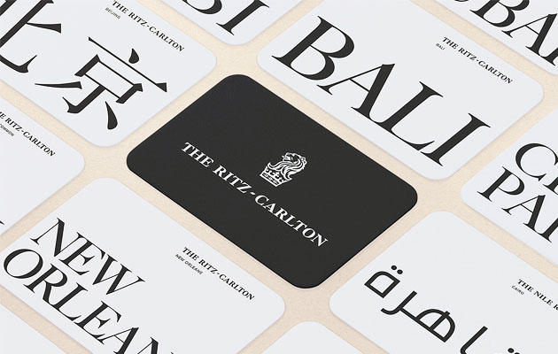
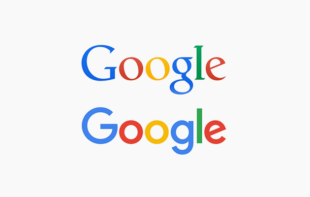
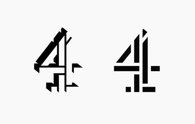
Last month Google changed their logo for the first time since 1999, upgrading to something sleeker and more functional across multiple outlets. This has been followed by a bit of a refresh for Channel 4 and, perhaps not so widely critiqued, a new look from brands like The Ritz-Carlton.
Joining the discussion, we’ve taken a look at why a redesign can be a good idea, found some great logo examples, some not so great examples, and we consider why now might be the time to try something new.
To start with, as the size of our digital viewing devices have continued to shrink it has become more vital than ever before to have a responsive and recognisable identity. Something that will fit on a tiny screen but remain clear enough as the screens get smaller (hello, Apple Watch). Ideally your logo needs to encompass everything you’d want someone to know about your brand, your online identity and your company at a glance, without you having to say a word.
A decent logo design can, in theory, allow you to cross language barriers. Take a look at how we now communicate; there are symbols for everything. A few years ago if you’d shown people a small image of a cloud you’d only evoke thoughts of the miserable English weather, but today, depending on the setting, you’re more likely to make them think of data storage than precipitation. Three curved lines are now a sign that there’s Wi-Fi available. Beyond that, four lines now means you can pay using contactless payment. We’re reducing communication to a series of symbols to compensate for, and keep up with, the newest technology. Maybe the Egyptians were onto something with their hieroglyphs.
It’s not just Google – we’ve all come a long way from 1999 too. That includes you. We are, on the whole more visually opinionated than ever thanks to platforms such as Pinterest and Instagram. We know what we ‘Like’ and what we don’t. Everyone’s a design critic which means it’s more important than ever to have something that’s as clever and visually appealing as it is functional and recognisable.
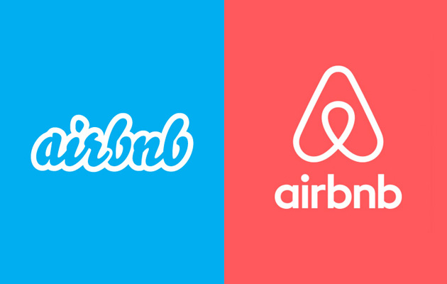
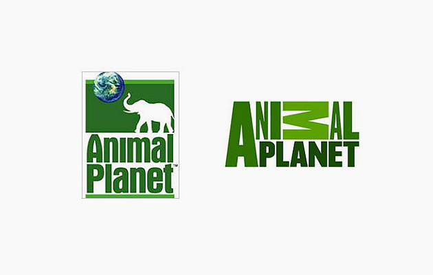
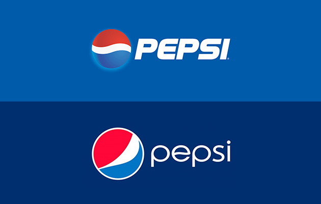
When Pepsi tried to modernise their image by introducing a new logo it went down like a ton of bricks. With many people saying it looked more like a fat belly than anything else, it wasn’t exactly the brand image they were going for. The Oxford Dictionary also made an attempt to be modern and hip and have gone a little too far. Looking a little too similar to the Beats by Dr Dre branding, this redesign doesn’t quite sit with the prestige that was associated with the brand. Few people seemed impressed with the Airbnb make over and it would appear that the reception the new Animal Planet logo received wasn’t exactly warm either. Feedback suggested that the audience thought that having the awkward M in the Animal Planet logo lying on its side like an injured animal was not a good, or particularly well thought out, idea.
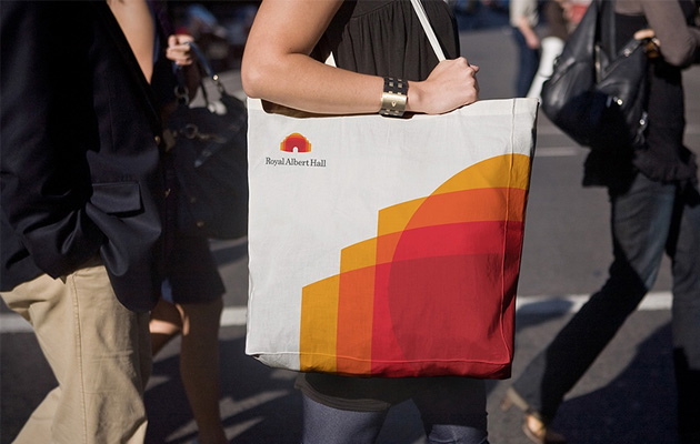
But there are some great examples out there. The Google rebrand has generally been received well, the new Freeview logo seems to be proving popular, and The Royal Albert Hall have really brought themselves up to date with their new silhouette, which has been designed to be used across various media.
People often underestimate the value of having a unique logo that was designed and customised just for them, in order to be professional and memorable, especially online where there are a million companies offering the same services.
Of course, an effective logo is only the beginning but it can certainly go a long way, especially in these digital times. And who knows, maybe a new logo could be the start of a whole site redesign. If this sounds like something you might like to chat about, get in touch and we can get our talented team of designers on the case.