We recently got our hands on the tremendous ‘Five Simple Steps: A Practical Guide to Designing for the Web‘ by Mark Boulton and we were so impressed, we wanted to post a little review to recommend the book to people who may not have heard of it.
Although the book states it’s about about designing for the web, even Mark himself admits the ‘book is about graphic design practice as applied to the web.’ The book is useful for is for people who ‘want to learn the basics of graphic design and apply them to their web designs, producing more effective, polished, detailed and professional sites’.
The book has five main chapters:
1. Getting Started
2. Research and Ideas
3. Typography
4. Colour
5. Layout
Each chapter is broken down into smaller sections and really goes into detail about each topic, for example lets take a look at the Layout section.
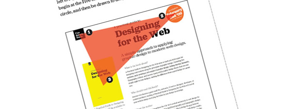
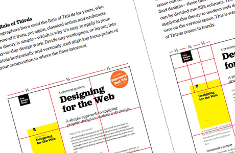
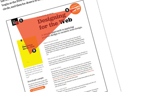
The chapter begins with a look at composition, talking about the rule of thirds, looking room, and triangles.


Mark then goes on to speak about spatial relationships, white space and my favourite section grid systems.
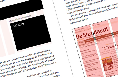
Mark ends the section with a fantastic case study of his companies redesign of Flemish newspaper website De Standaard. This is such a detailed section containing info on the brief, project constraints, designing the grid and design of the site.

While this isn’t a particularly in-depth review, we felt compelled to write a recommendation for Marks book due to how much we enjoyed it.
You can purchase Five Simple Steps: A Practical Guide to Designing for the Web in both paperback and PDF editions.