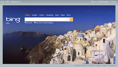
Microsoft launched it’s new search engine late last week, the name and logo has came in for a little bit of criticism from the web community but let’s forget about that for a second and take a look at the service itself.
Bing replaces Live as Microsoft’s search engine service, finally deciding to drop the latter for it’s supposed sub-10% search market share. Couple this ever-reducing market share with the failed deal with Yahoo and many have considered Live search redundant for a while now.

It’s reported that Microsoft plan to spend somewhere between $80-100million on its marketing campaign to try and claw back some search engine real estate. This is a massive number when you compare the $25million Google spent on marketing in the whole of 2008.
It’s hard to argue that leaving Live behind wasn’t the right thing to do, Microsoft never even owned the livesearch.com domain, it’s attempts to do so were widely circulated and lost the company a bit of face to say the least. That domain was / is owned by Tyler Tullock who used to run an Internet marketing company, “Tyler says he has had multiple offers for the domain from parties acting on behalf of clients, so he has no idea as to whether Microsoft was trying to buy it from him. He has told potential buyers he wants $800,000 for the domain, but has turned down the highest offer he received of $200,000.”
It seems Microsoft may not be taking on Google et al directly however, but taking the approach of pointing out discrepancies in ‘todays search engines‘. PC World state “Microsoft offers some internal data indicating 42 percent of all searches need to be refined after the first query, AdAge reports. Furthermore, Microsoft has found 25 percent of all post-search clicks hit the back button instead of a Website link when looking at a search results page.“ Concentrating on the usability or refining area of search is an interesting approach, which is certainly needed given Googles stranglehold on the industry.

The search engine has a couple of problems before it even gets a proper release and has time to breath. The first is that it’s a Microsoft product and a lot of people either don’t like their products or the company itself, the second is that people have got used to simple and bloat-free search with Google and as soon as you arrive on Bing you just feel as though it’s a lot more complicated, even if it is just a few links and a search box much like Google. Why not do away with the peculiar large image for the background and just use a standard gradient background and make the search box and relevant options the real emphasis on the page?
The problem Microsoft have now is that Google is embedded deep into peoples brains as being search, the second and third generation of Internet users may have not even used a second search provider, after all what do these alternatives offer that could pull people away from Google?
While dropping the Microsoft part from it’s search service could improve trust with the engine, many people see the rebrand as a last ditch attempt of masking a poor search engine algorithym.