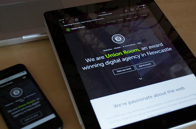
You may have noticed that you are currently using a shiny new version of the Union Room website. We spent the back-end of 2013 working on the project, squeezing in as much time as possible working on the website alongside client work. We are still adding content and features, so we have yet to announce the launch on social media.
We are very proud of the new website, for a few reasons in particular.
Responsive
It is the first version of our website that has been built responsively, meaning that the website will adapt to the device it is being viewed upon. We adopted the responsive website design approach in 2012, and it has changed the way in which we plan, design and build websites across the whole team. Try viewing our website in a number of devices to see how the content adapts to your device.
Video
We worked on a number of projects in 2013 that saw us help clients produce video content for a number of platforms. This helped us see first hand how engaging this kind of content can be, and that we wanted to include it on our new website. Our friends at Pyramid Media came into the studio and shot some great footage that we’re currently using around the website.
Video content is expected to be a big trend in 2014, as broadband speeds increase and more websites adopt HTML5. We’re looking forward to see what is possible with video content this year and how we can use it to engage audiences.
Work
We worked with some great businesses last year. Projects for the likes of Agents Property Auction, Pearson Engineering and Story Homes saw us create responsive, content-heavy websites and small screenshots struggle to reflect the detail involved in the work. We wanted to create a more in-depth case study page that contained large images of each website as well as some more information about the project itself. We used jQuery to highlight specific elements of each screenshot, helping us explain why certain decisions were made along the way.
We hope you like our new website and enjoying using it.