
In early February, we were approached by Sanderson Young to redesign and redevelop their existing website. The current website had been running for a little over 10 years, and was holding the business back in terms of what they could achieve on the web.
The following case study explains the processes and decisions that were made in the project timescale, and how we helped to re-shape Sanderson Young’s online presence. You can hear what both ourselves and Sanderson Young think about the project, by watching the new website promo on this link.
Background
As we have already mentioned, the Sanderson Young website had been running (albeit with updates) for over 10 years in it’s current form, and had been performing well for the business in that time. However, with the emergence of new technologies and new property websites such as Rightmove and Zoopla, the average user has come to expect a number of standard features across real estate websites, most of which Sanderson Young were missing.
Our main tasks were to bring the design of the website up to date, but more importantly give the users of the Sanderson Young website as much functionality as possible when searching for and viewing a property. We will detail most of this new functionality later in the post, but the main elements of the project were:
- The ability for the user to quickly search for, and view a property.
- The easy management of featured properties on the homepage.
- The ability to search via an interactive map and view properties by their location.
- Rebuild the service directory and make it more useful to the end user.
Alongside these elements, our aim was to improve the general usability of the whole website and allow people to navigate to important information as quickly and easily as possible, as well as making life easier for the Sanderson Young team to manage the website.
Wireframes
Any large projects we undertake involves a wire-framing process. We find that this is absolutely integral to ensuring that the main elements on the page are arranged in the right order, and the client is given the opportunity to look at our ideas without the distraction of fonts, colours or imagery.
This allows us to concentrate fully on layout, and approach the website in the role of a potential user. The wireframe below was one of the first we presented to Sanderson Young, and gave them some options in terms of where important elements would sit.
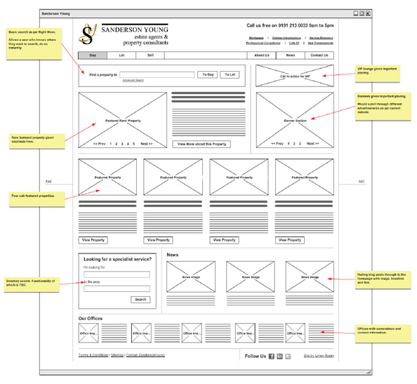
The wireframes were tweaked several times (much quicker than changing a ‘full’ design) until the team were happy with the overall presentation of the page.
Design
With the wireframes agreed upon, we were in a great position to begin the design work. You can see our initial idea for the homepage below, which loosely matches one of our initial wireframes above:
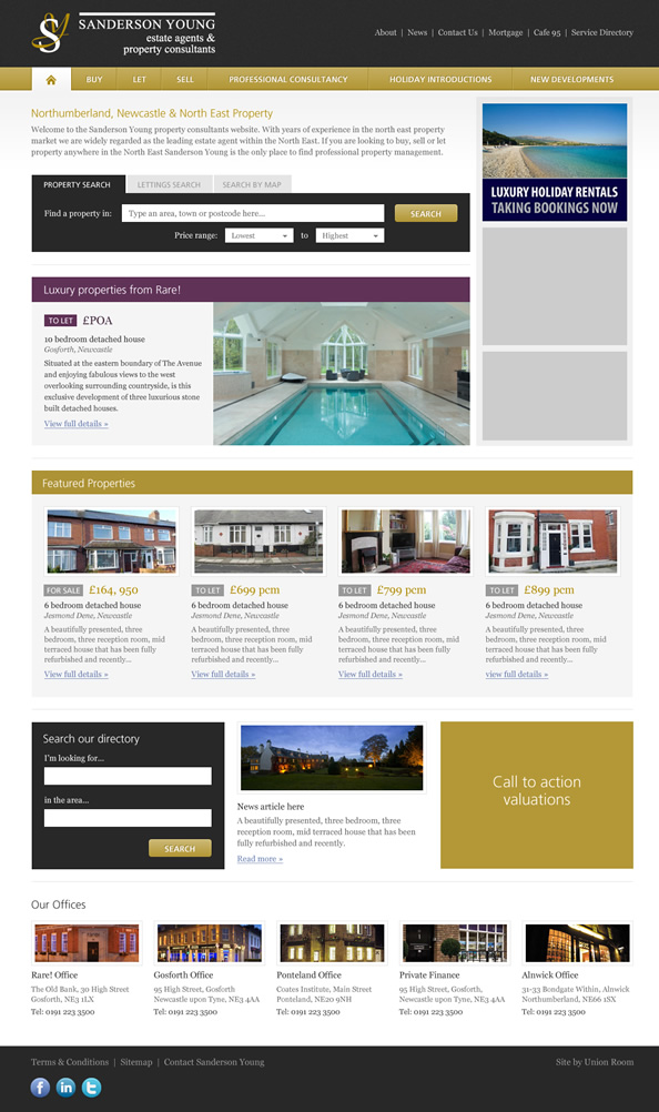
As you can see from the visual, we still had some decisions to make regarding the design of certain content blocks, which we made progress with over the next couple of versions.
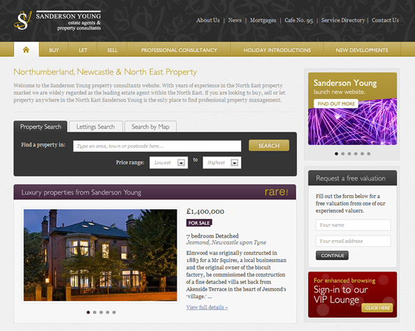
The aim of the design was to convey a high end look, especially with the inclusion of the rare! section on the front page, which Sanderson Young use to advertise their luxury (£700,000+) properties. In terms of typography, we used a mix of Gill Sans (for titles and calls to actions) and Georgia (a classic body font) throughout the website, which we think works well in giving the site that high end feel, but still retaining a modern look.
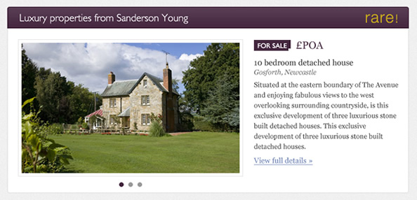
The colours and patterns used on the site were taken from the Sanderson Young branding, as well a mix of their literature such as sellers packs, seasonal magazines and staff profiles. The sheer amount of items we had available to us made it easy to introduce accent / additional colours throughout the pages of the site.
Development
Although a design refresh was needed, the main driving force behind the new website was the improvements to the website’s functionality, and allowing the user to perform many more tasks whilst using the website. These elements of functionality ranged from back-end elements, making Sanderson Young’s job of maintaining the website easier, through to completely new features that would benefit the user.
Control
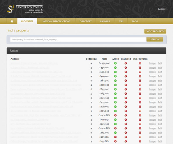
The new back-end allows the Sanderson Young team to control properties on the website in a much easier and in-depth way. An example of this being a new control panel which allows the team to quickly edit a properties status (under offer, sold, price, active state etc) without entering the properties, saving countless clicks through the life of the new system.
Featured properties
Sanderson Young offer some of the North East’s most exclusive properties, and wanted to display a selection on their new homepage. The featured properties provide the user with a large call to action, and give Sanderson Young the opportunity to showcase selected homes of their choosing.
Regions
The old website allowed users to search via only one region, this would limit the effectiveness of the search and push people into doing multiple searches across regions / properties. The new structure allows users to complete an advanced search across multiple regions, meaning they never have the need to fulfill more than one search (unless their results aren’t relevant).
Blog
Although the old website had a facility for Sanderson Young to keep users up to date, the many categories were spread across multiple pages and sections, making it hard for users to find what they were looking for. The new WordPress blog utilises categories, allowing the team to publish posts to their relevant sections for quick and easy access.
Interactive floorplans
The current website offered floorplans in their most basic form, allowing users to see the dimensions of a property across its various floors. The new website gives users interactive floorplans, where they can see images for specific rooms, as well as virtual tours for some properties.
Service directory
The service directory gives users an index of businesses that anyone looking to buy or rent a house, could find interesting. The old directory was very linear in design, and lacked a search facility for users who knew what they were looking for. We took the existing database and built the new directory from the ground up, making it easier than ever for users to find services for their new home.
Conclusion
We’re delighted with the final product, and initial feedback / statistics from Sanderson Young show a sharp increase in viewing arrangements, website traffic and user interaction across the full website.
We’re looking forward to continuing work on the website, helping Sanderson Young cement their place as one of the North East’s leading estate agencies.