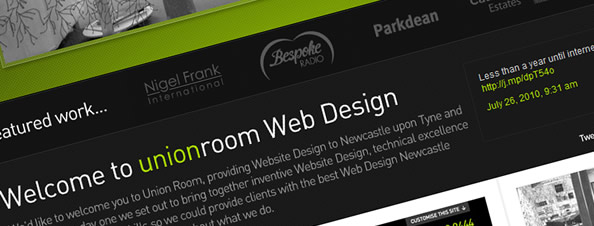
Way back in November 2009, we began chatting about a new Union Room website. As is always the case with internal projects, we were very excited as it allowed us the complete freedom to design and build anything we felt like.
Although our current website was performing well, it was starting to look a little old (after all, we did launch it in mid-2008) and with so many great new tools available, both in design and development, we decided it was time to showcase the great things we’d been doing for our clients, into our own website.
After a few initial meetings with the entire team, we began to settle on what we thought the new site should contain and also what we thought we could improve from the old site. We all agreed that there were some things that the new site definitely needed to do:
1. Showcase our work
We found that although we were helping great companies like Beacon and Parkdean Holidays show off their great work, we weren’t doing the same with our small thumbnail screenshots. We decided that the work we do should be the first thing a user notices when they visit the website.
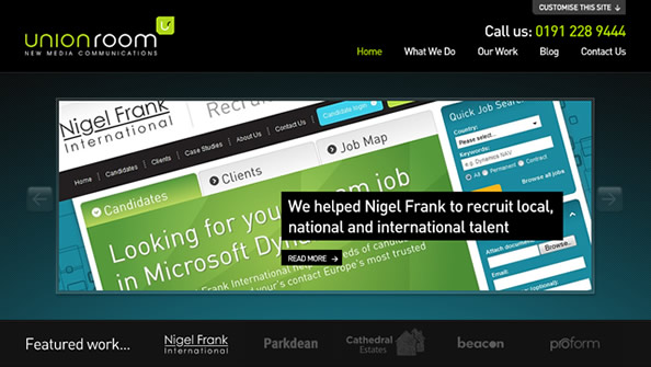
We decided to really open up the new site and put what we do first and foremost, design and development. We’ve added a large space for a screenshot as well as a little bit of info about each featured project.
2. Promote our blog posts
We put a lot of work into our blog, ensuring that it’s not just filled with information about what we’re up to, but with interesting things like design showcases, free downloads and things we just think look and work great. With that in mind, making people aware of our blog was a top priority.
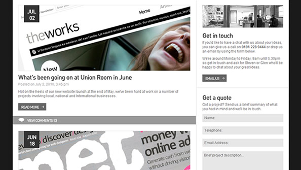
That’s why we’ve taken away a lot of the content we had on the old homepage, and replaced it with the latest posts from our blog. This helps make the articles we write a lot easier to find and should help increase the readership of our blog.
3. Updating easily
We help develop content management solutions for almost every single client we work with, so it made sense that we should have one to. After creating bespoke content management systems for a lot of clients in the last 18 – 24 months (our personal favourites were Response Gaming and Proform Performance, keep an eye out for a bit of a behind-the-scenes blog post on those soon) we decided that the new site should be easy to update and should allow anyone from the Union Room team to jump into the back end and update content.
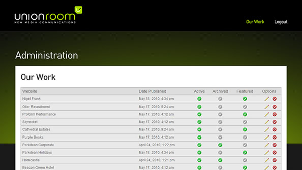
Sitting behind the website is a full content management system which allows us to update almost any content on the site, this has already saved us a lot of time since we launched the site.
Although there were a few other smaller areas we discussed, these were the main elements we felt we could improve on. Let’s take a look at a couple of main areas of interest from the new design, and also a look at the websites content management system in more detail.
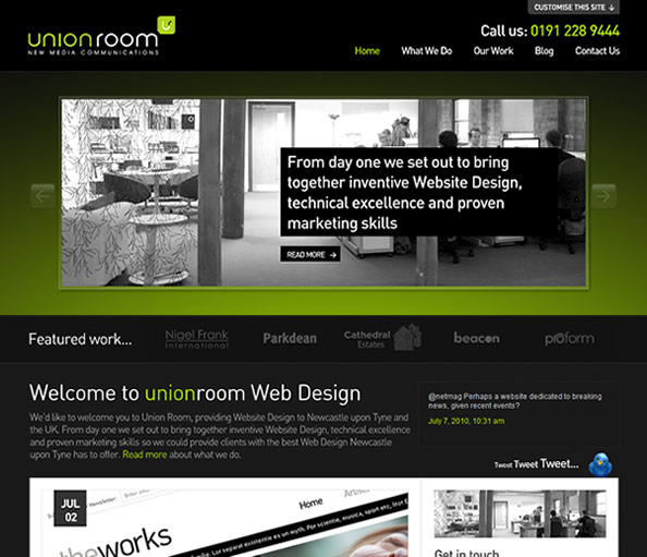
The Homepage
As we’ve already discussed, we wanted the homepage to be a hub of information for the website which showcased our best work and blog posts, briefly explained who we were and give users a quick and easy way to navigate to important pages.
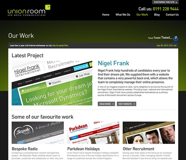
Our Work
The new our work page allows us to highlight a particular project we’re proud of and gives a lot more information about the project than our old design. It also gives the user access to our large archive of work.
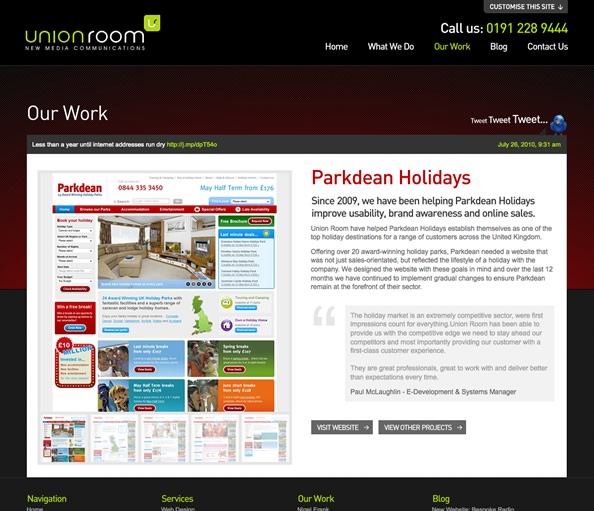
Our Work – Read More
A lot of work goes into preparing our websites so we didn’t want to just give users the option of seeing the site in action, we wanted to explain to them how we approached the project and what it’s achieved.
The extended project view gives us a chance to speak a little about the project, show off some more screens and also gives us a place to insert a glowing testimonial.
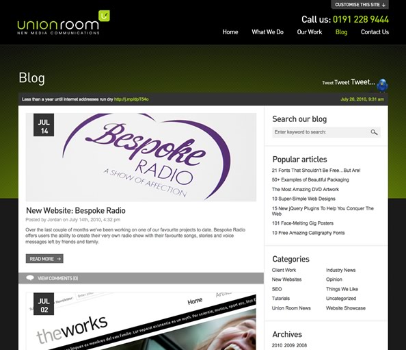
Blog
As we’ve already spoken about, the blog is an important part of Union Room and we really wanted to emphasis the work we put into it with the design.
We’ve given up a lot of our homepage to the blog and also given the main blog post, and the posts themselves, a major overhaul. We’ve now got larger images and a neater, easy to read style applied to our posts which helps read some of the longer posts we sometimes post.
The admin panel
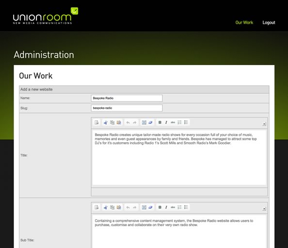
The admin panel really allows us to manage the content on the work section, meaning we can update pieces of work or insert new projects at anytime, without the need to hassle one of our developers.
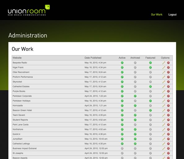
The panel allows us to upload images, create themed backgrounds on the fly, update the featured work on the homepage and completely manage the order and priority of work that is shown both on the homepage, and on the our work page.
The Future
Although the website has only been live for under 2 months, we’re already planning our next round of updates and constantly looking for ways that we can improve the site for our users.
Keep an eye out for some updates in the next few weeks, we hope you like the new site.