There aren’t many things more beautiful in life than a good looking font, as we displayed in our recent free fonts blog post. So we thought it would be a good idea to ask some of the webs best designers what their favourite fonts were.
…………………………………………………………………………………………………………………………………….
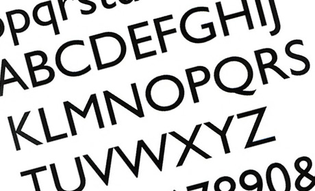
Jacob Cass of Just Creative Design
Favourite Font – Gill Sans
Why? – I find it works great with so many other fonts…it’s so versatile.
Also have you heard the Gill Sans joke? I apologise in advance. What is a fishes most hated font? Gill Sans.
Btw, did a similar post recently that may be of interest:
http://justcreativedesign.com/2009/06/23/designers–favourite–fonts-why/
…………………………………………………………………………………………………………………………………….
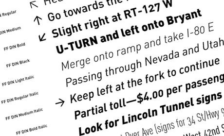
David Airey
Favourite Font – FF DIN
Why? – It’s a practical, impeccably designed family by Albert-Jan Pool.
…………………………………………………………………………………………………………………………………….
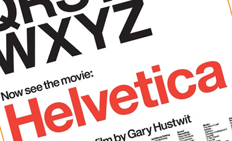
John O’Nolan
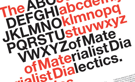
Favourite Font – Helvetica
Why? – My favourite font is unfortunately one which will probably annoy some people! I absolutely love Helvetica. It comes across as a strong, bold, clean font, that fits in to almost any design.
When used with narrow letter spacing, as I often do, it transforms completely and becomes almost graffiti-esque in nature. I’ve always had a thing for geometric designs, so the very square and symmetrical style of Helvetica appeals to me greatly.
…………………………………………………………………………………………………………………………………….
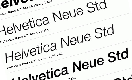
Phil Lowery of Projector Brand Communications
Favourite Font – Helvetica Neue
Why? – My favourite font would be Helvetica. Helvetica Neue to be precise. I think it’s got so much versatility it’s one of the best examples of Fonts ever.
It’s used the world over for it’s clean lines and it’s probably one of the most common used fonts, yet it’s always one of the first fonts many designers choose. It works big, it works small, heavy or light – it just works.
…………………………………………………………………………………………………………………………………….
Chris Spooner of Spoon Graphics
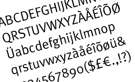
Favourite Font – Meta
Why? – it’s a hard one to pick out, a few of my favs are DIN, Cocon, Meta and Dax, but I’d probaby have to pick out Meta as my favourite
http://new.myfonts.com/fonts/fontfont/ff-meta/
I particularly love the little flicks on the lettershapes which give it that little touch of visual interest, while being an easily readable and modern font. I also like the fact that it’s quite a recent release by Erik Spiekermann (2003), but is bound to stick around for years to come as a modern classic.
…………………………………………………………………………………………………………………………………….
Graham Smith of I’m Just Creative
Favourite Font – Helvetica
Why? – Yes, I would have to say Helvetica, but good for people to know why I like it so much! (Graham is a keen Helvetica lover and runs lovehelvetica.posterous.com).
Helvetica is truly versatile. Many people just know it by the roman and bold versions bundled on Mac’s and PC’s, so it gets a bum deal here. Many people view Helvetica in the same way as Verdana or even Comic Sans, just because it’s so prolific. It’s everywhere, so it must be rubbish. Knowing the history of Helvetica is essential in getting it to work for you.
The trick is using the whole family, everything from condensed, expanded, thin, heavy, rounded, outline. Each weight offers an extreme personality makeover. Add to that its ability to morph into yet another personality when you play with the spacing. Helvetica Neue Super Duper Thin is class, very refined, Helvetica Neue Heavy is just that, heavy duty. Yet it still looks neat, and stylish.
That’s the appeal of Helvetica. If you know what you are doing and also, more importantly have the confidence, you can pull of remarkable looking designs.
…………………………………………………………………………………………………………………………………….
Brian Hoff of the Design Cubicle
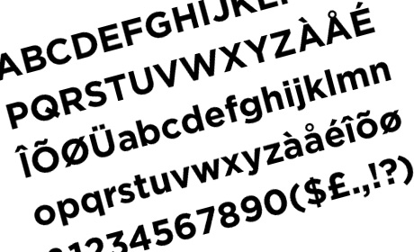
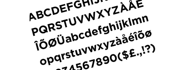
Favourite Font – Gotham
Why? – While this is an extremely difficult decision for me to chose my favorite typeface I would have to say Gotham by H&FC, but really anything by H&FJ is my favorite. Gotham in particular has such a huge family that it works for small text and is suitable for headlines and large signage as well. Versatility is what makes a great font and Gotham definitely captures it.
…………………………………………………………………………………………………………………………………….
Wez Maynard of OC Vision
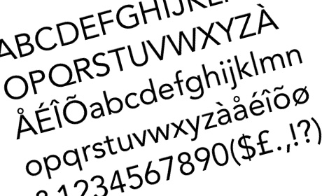
Favourite Font – Avenir
Why? – It’s a firm favourite of mine, as is the Mercury family from Hoefler.
…………………………………………………………………………………………………………………………………….
Daniel Oliver
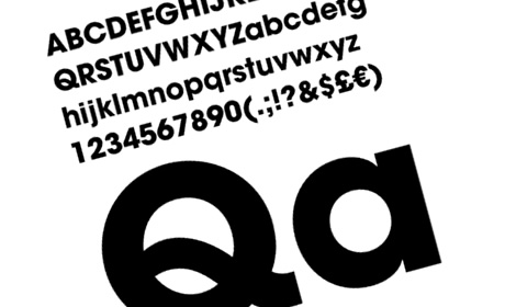
Favourite Font – ITC Avant Garde Gothic
Why? – It’s a really hard one to decide and although I’m not totally sure it is my favourite, it’s certainly one of my preferred.
Read more about ITC Avant Garde Gothic
…………………………………………………………………………………………………………………………………….
Aaron Russell
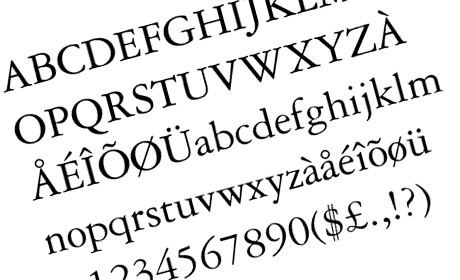
Favourite Font – Garamond
Why? – If I had to be stuck on a desert island with only one font of course it have to be Garamond. It wouldn’t help me much in foraging for food or signalling to passing ships, but it would give me something absolutely stunningly beautiful to look at all day and all night long.
…………………………………………………………………………………………………………………………………….
Sarah Parmenter of You Know Who Design
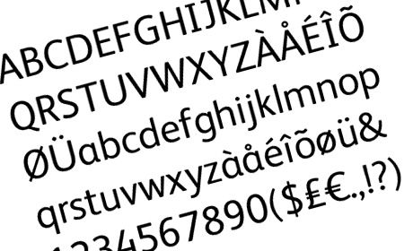
Favourite Font – FS Albert
Why? – it has enough versatility to look corporate without looking *too* stiff with it. It has some great characters that set it apart from other San-Serif fonts. All fonts by Fontsmith are brilliant, it’s having the budget to buy them all! Gotham would be a close second, but as it’s already mentioned in this post, I thought I’d choose FS Albert.
…………………………………………………………………………………………………………………………………….
Selene M. Bowlby of iDesign Studios
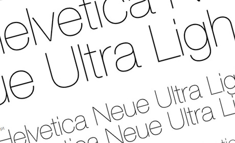
Favourite Font – Helvetica Neue Ultra Light
Why? – It’s clean, it’s simple, it’s elegant. I’m a less is more type of gal, and Helvetica Neue’s clean, simple lines speak volumes. Simply beautiful!
