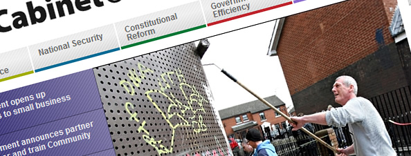
Phew 44 websites in all, the UK government offers a selection of services and information across the board; whether or not the website is well designed or useable is a debate in itself. Maybe you can decide?
Following a National Audit Office report, the Public Accounts Committee (PAC) published a critical review of progress in improving the Government’s internet practices in its 16th report of session 2007/08.
One of the issues the PAC concluded was “one third of all government websites did not comply with government’s own user accessibility standards and all should meet the requisite standards by 2011.” Rather contradictory but vital when some government sites recieve an average over 8 million unique users per month.
Based on satisfaction surveys conducted by the COI on ‘quality of central government websites’ the net visitor satisfaction rating was barely 80%; ease of use as low as 1%, design and content accuracy under 70% and almost one-third didn’t have a search tool.
Personally, considering the amount spent on websites you would expect a much more rich user experience, functionality and accessibility. Let’s take a look at the culprits:
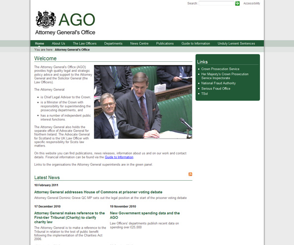
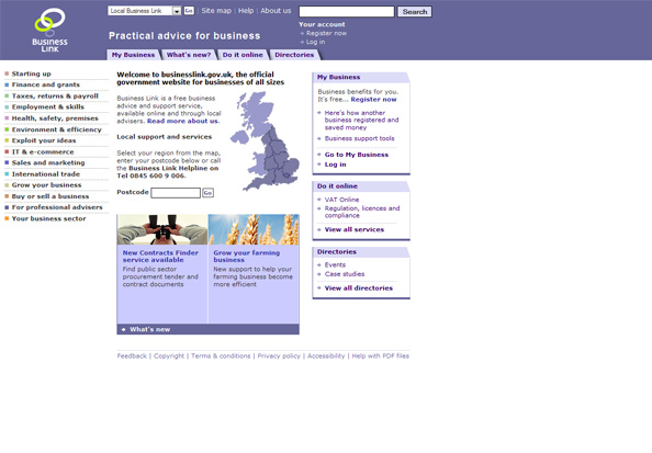
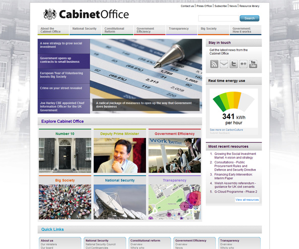
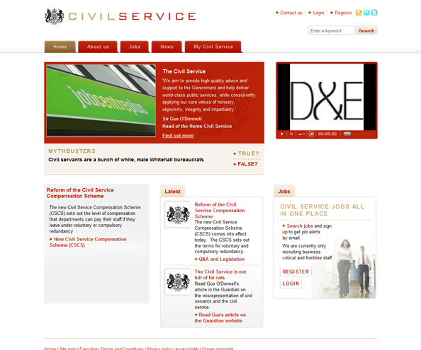
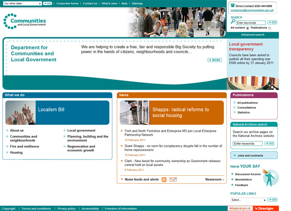
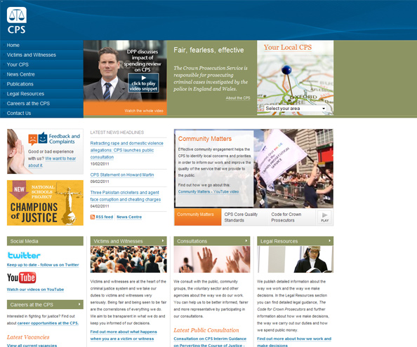


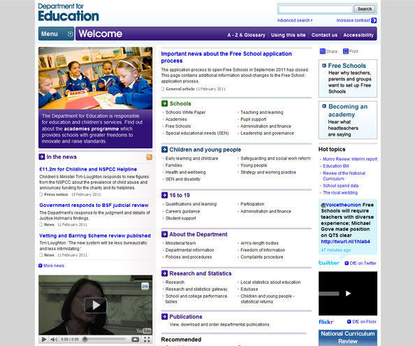
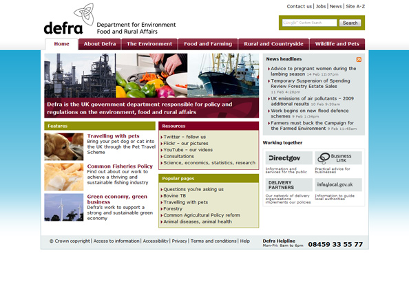

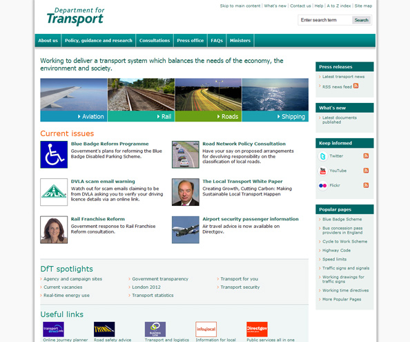
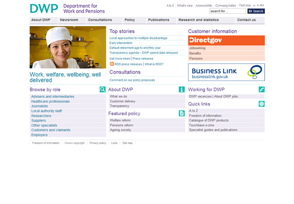

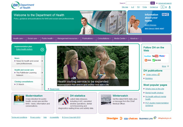
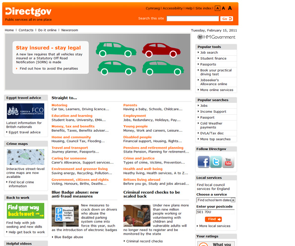
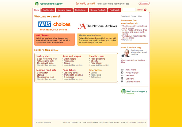
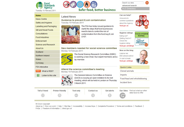
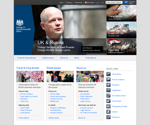
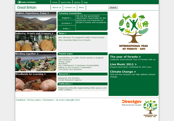

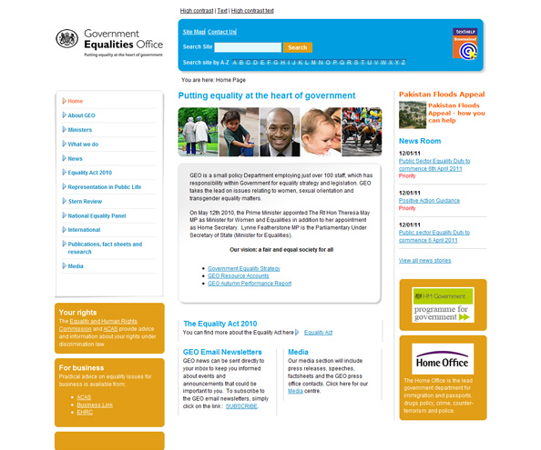
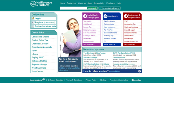
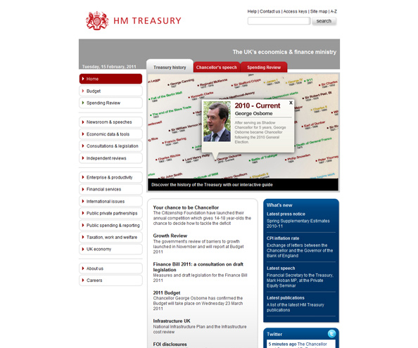
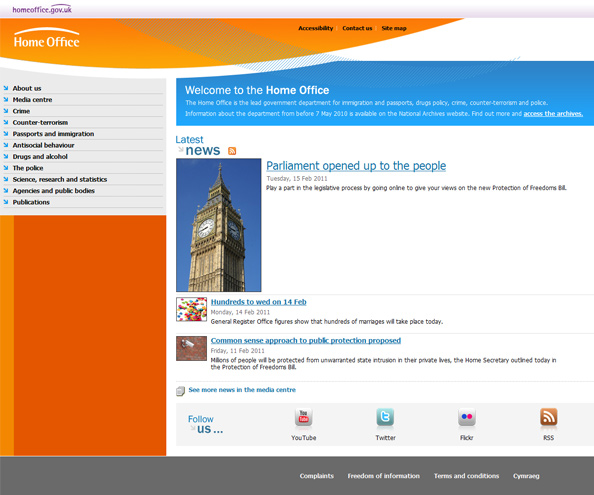
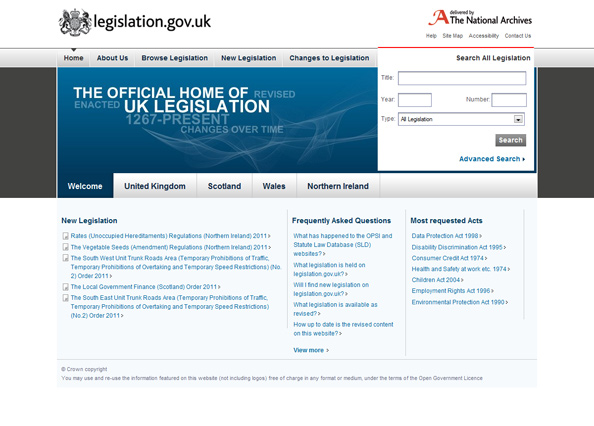
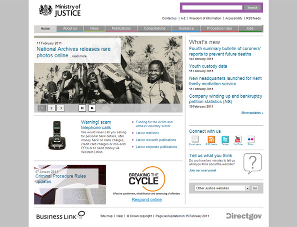
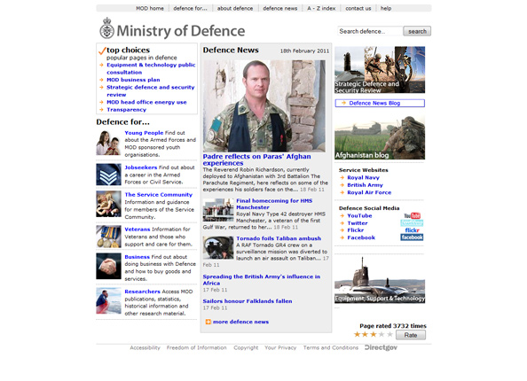
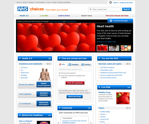
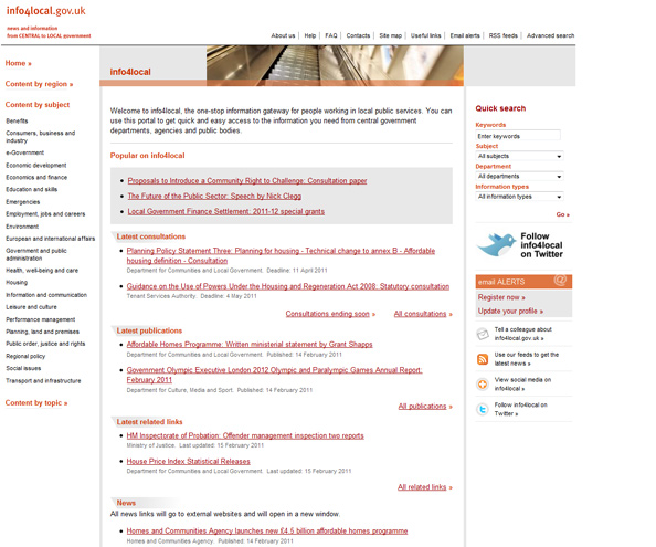
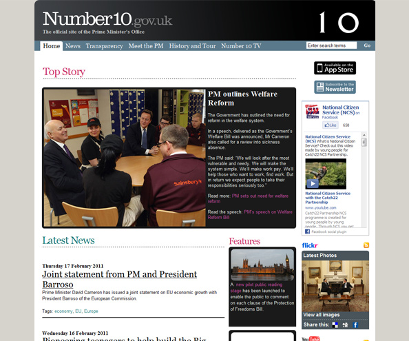
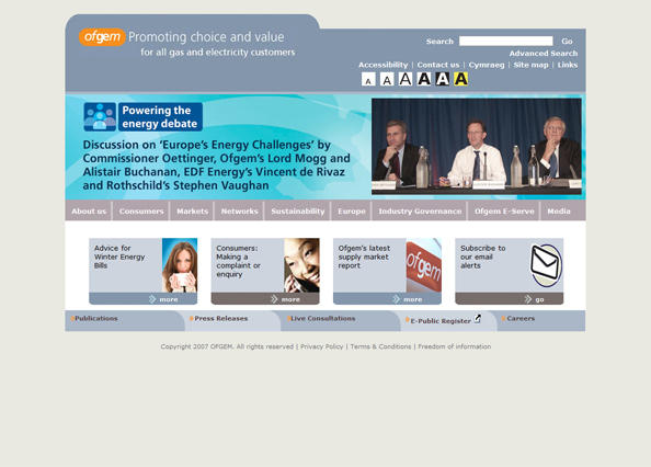

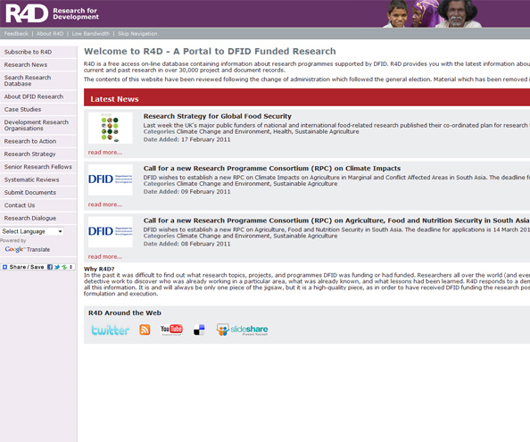
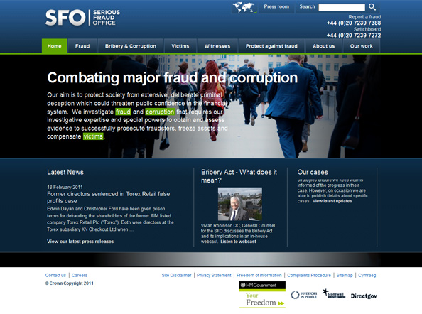
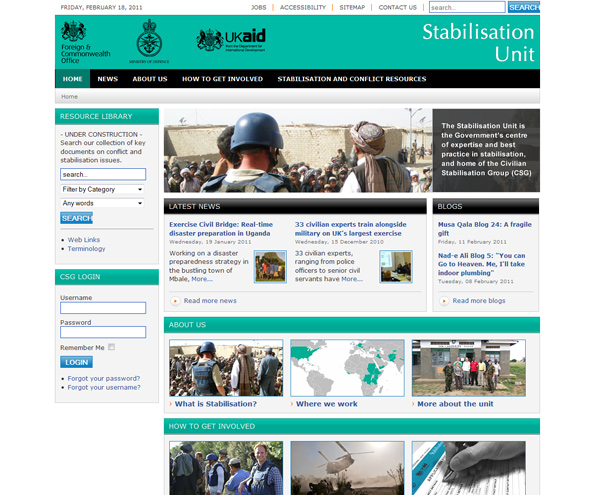
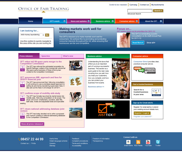
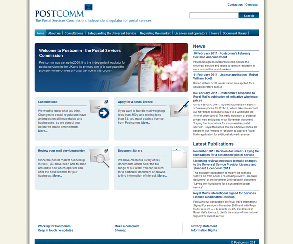
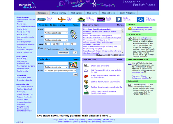
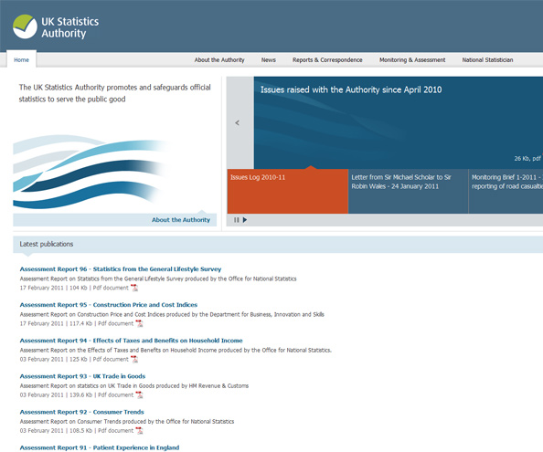
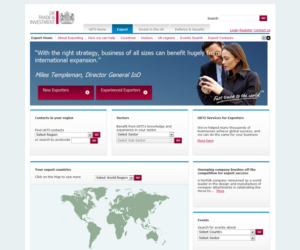
I think it’s nice to see that the Cabinet Office, Dept for Business & Skills and NHS Choices have took steps to improve the visitor experience and are more modern than some of the other examples.
What do you think?