If you’ve picked up a copy of .net magazine this month (the August issue, number 204) you may have noticed that Union Room have been featured in the monthly build-off feature.
We’re obviously delighted to have been given the opportunity by .net and a lot of work went into getting the design ready for inclusion in the magazine. As well as the website itself, we asked sister company Projector to help us create a brand which we could build the website around.
Lets take a look at what was involved in getting our ideas into the magazine:
1. The Opportunity
Like a lot of other design companies, we regularly sing the praises of social networking websites like Facebook and Twitter for not just helping to connect with customers, but to help discover new business opportunities. Back in early April we were alerted to a tweet (thanks to @yourprojector and @aidan_connor for the heads up) that .net made, asking for companies that have experience in the betting / gambling industry:
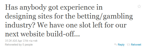
We’ve provided some great companies (including bet365, WBX, Ladbrokes and 32Red) with design and promotional work so naturally, we felt we were well suited to the task. A couple of tweets /emails later and we’d been given the go ahead from .net associate editor Oliver Lindberg.
This highlights just how valuable Twitter can be and the opportunities that a solid network of people can bring.
2. The Brief
Although there’s a short brief included in the article itself, we thought we’d expand on it a tiny bit just to explain our approach to the project. Although essentially a website for a sports betting website, we were given the option to place emphasis on the then upcoming World Cup. We decided that we didn’t want to theme the whole site around the World Cup (incase this dictated the visuals and content a bit too much) but definitely feature specific markets that would be popular whilst the tournament was taking place such as outright winners and top scorers etc.
The main usability / functionality target we were given was to ‘pull the visitor in, make them want to place a bet and make this process as easy as possible‘. We used this statement to completely influence both the website and branding for the company.
3. The Brand
We’ve worked with Projector on many occasions and it would have been a waste not to get such a talented bunch involved on such an interesting project. Projector didn’t want to just supply us with a logo to work from, they got to work on supplying us with a complete brand specification, detailing a ton of information ranging from company background to suggested tone and mood of communications.
Projector also kept our goals in mind throughout the design process. We needed to adhere to the magazines brief of puling the visitor in, making them want to place a bet and making this process as easy as possible. We wanted the brand to reflect these ideas of open, easy and informed betting.
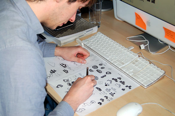
The specification was very detailed (to see the specification in full, visit the Projector blog) but we’ve picked out a small selection of the specification below:
i. What are we trying to achieve?
To create a new brand that encapsulates the very essence of BetterBet – the most knowledgeable and informed site to place a bet on a global sport.
ii. Who are we talking to?
We’re talking to all sports fans who like to place a bet or play the tables – no matter whether you’re a pro or beginner – everyone can join in. Predominantly male. Interested in global sports.
iii. What tone or mood is required?
Fresh, Modern, capable, reassuring look. In terms of tone it must be Informed, we want to create a place that provides knowledgeable information to help our members bet and to stimulate debate. The overall response should be that someone gets an informed global outlook, from a British company.
With the preparation work completed, Projector began looking at initial design ideas with the aim of presenting us with three or four ‘main’ ideas for the brand.
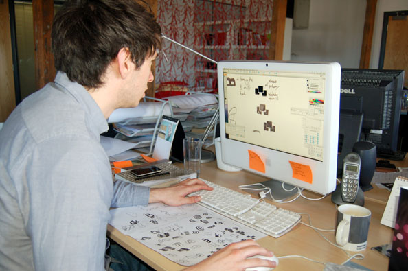
Although we eventually chose the branding you see above / in the final design, we were delighted with the choice that Projector provided and would have been happy in taking any of them forward. We asked Projector’s Dom Taylor for a few words on the final branding:
“The main focus of the BetterBet brand was to concisely encapsulate it’s position as the most enlightened and knowledgeable betting brand.
We decided to opt for a graphic target to symbolise the fact that BetterBet gets it spot on due it being the most informed of all betting brands. It hunts down the best odds, has most in depth background information, so you know you have the full picture before pledging your money.
In terms of colour, the idea was to keep it fresh and modern giving it a unique colour scheme to separate it from other bookmakers. We were also keeping in mind the “value for money” overall look and feel of the brand.
When choosing logotype we opted for a no-nonsense bold sans-serif approach. The type Akzidenz Grotesk, being a sans serif will ensure a contemporary feel due to it’s ageless quality.”
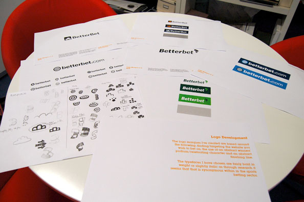
To take a look at the rest of Projectors ideas for the BetterBet branding and the processes they used to create them, take a look at their BetterBet case study.
4. The Functionality
Like any project, before we begin thinking about design we’ve got to spend time looking at the projects aims, goals and functionality. In line with the brief from Projector, we wanted to design a betting website that was a) easy to use, b) accessible for both new and experienced gamblers and also c) highlight the emphasis on interactive video.
Although almost all of the betting websites we researched were accessible, we wanted to really help new users see markets that they could be interested in whilst serving experienced users with the usual markers and odds that they’d see on any other sports betting website. We decided to implement featured sections specifically aimed towards users who were perhaps just interested in placing a bet on the World Cup, grabbing users attention instantly.
We also wanted to place a really big emphasis on video for the website. A lot of sports betting websites use flat imagery to promote games / markets and due to their layout, these images are usually quite small and don’t really help sell these featured sections. We wanted to use video to raise awareness of both our live streaming services and also to highlight upcoming matches and featured markets.
Combining these elements for new users with engaging use of video, we were confident BetterBet could stand out in a crowded sector.
5. The Design
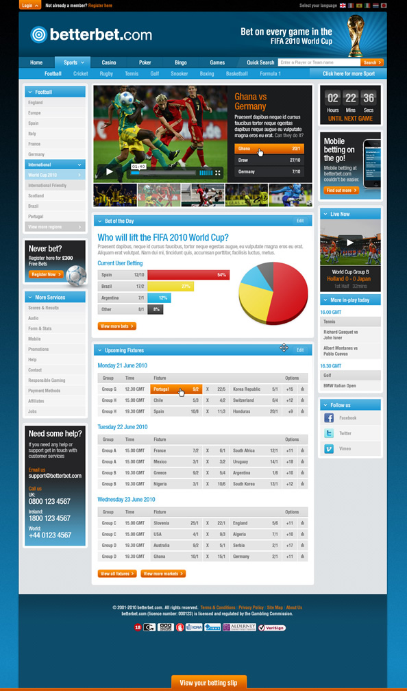
The aim of the design was to reflect the brand values suggested by Projector and also give the users of the website an easy to use and interactive experience. We’re really happy with the overall look and feel of the website and although it’s hard to see all of the proposed functionality on a flat graphic, we’re confident that we’ve highlighted the main areas of focus.
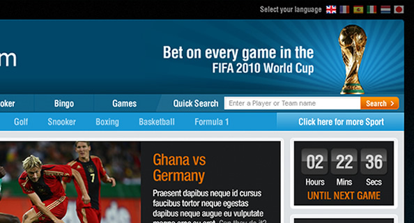
We’ve used the top banner to advertise the World Cup. This can be changed depending on the sporting event taking place or could be used as advertising space if we’re between events.
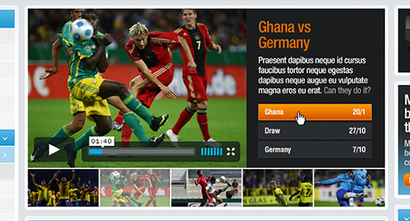
The main section at the top of the website helps advertise featured and upcoming games through the use of video.
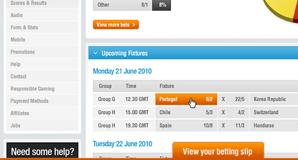
We’ve got the usual market sections around the page as well as a dynamic betting slip which can be accessed no matter where you are on the website / page.
The final design was the result of several design meetings and was based off a wire-frame we produced relatively early on in the process. Take a look at the wire-frame by clicking here.
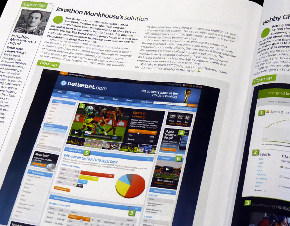
We’ve highlighted 6 main sections of the design in the magazine:
1. Login & Betting Slip
2. Video Promotion
3. Customisable Content
4. Mobile Betting
5. Bet of the Day
6. Live Betting
While we wont go into these points in detail (the article itself has more information on the design), they are our main points of emphasis on and the things that we’ve thought most carefully about for our users. You can find out more information about the design in this month’s .net magazine as well as seeing two other fantastic designs for the build-off.
Thanks for reading and if you haven’t already done so, make sure you pick up the latest .net magazine which is out now.
